Eterno Filter Coffee Packaging & Brand Design
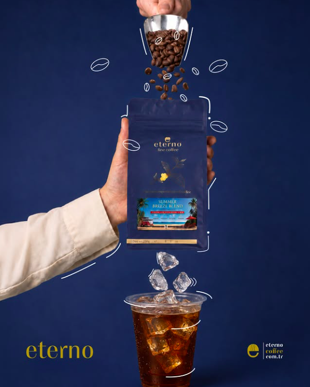
Eterno is a coffee brand owned by Ezel Kahve Kuruyemişleri, a long established coffee and nut company based in Konya, Türkiye. The brand was created as a more contemporary extension of Ezel’s coffee range, with its own visual identity and
packaging system.
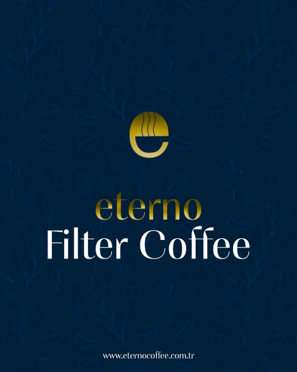
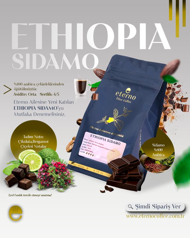
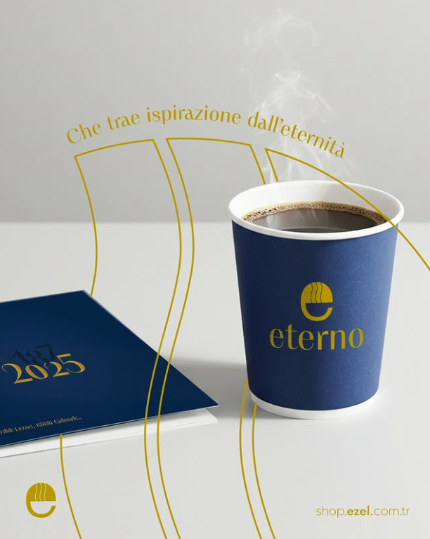
My work on Eterno began with the Filter Coffee line. I was responsible for developing the visual identity of the product, including the logo, typography, and packaging design. The aim was to create something that felt modern and distinct while still fitting naturally within Ezel’s existing product family.
A large part of the project was building a visual system rather than designing a single package. The logo needed to work at different sizes, the typography had to remain clear across different formats, and the packaging needed enough flexibility to support future products without losing recognition. I worked on how these elements interacted with one another so that the identity could be carried consistently across the range.
The Filter Coffee packaging became the starting point for Eterno’s wider visual language. From there, I continued developing packaging for other products, including instant coffee and coffee creamer pouches. These later designs followed the same core identity while adapting the layout and hierarchy to different product formats.
The project has continued to grow beyond the original Filter Coffee packaging. I am currently working on additional projects involving both Eterno and Ezel Kahve Kuruyemişleri products, with the goal of keeping the visual language consistent while allowing each product to have its own character.
Eterno has become one of the most important projects in my portfolio because it has allowed me to work on a brand over time rather than treat design as a one-off piece of work. It has involved identity design, typography, packaging, product variation, and maintaining consistency as the range expands.
The project is still ongoing, and I expect this page to continue growing as new Eterno and Ezel products are developed.
Game UI & 3D Animation for “The God Squad”
The God Squad was a horror game hobby project developed by Nick Hammer and his team. I worked on the project from May 26 to August 10, 2024, creating the main menu visuals and the 3D animated background atmosphere shown in the final menu.
The project had a dark paranormal horror direction, visually reminiscent of games like Phasmophobia. My goal was to make the menu feel atmospheric from the very first screen rather than just functioning as a static interface. To do that, I designed the final menu presentation around a moody horror setting, using a dimly lit environment, rain, and a cinematic composition to create tension and mystery.
The background animation was fully created by me in Blender, where I built the scene and developed the overall visual atmosphere for the menu. I also designed the menu presentation so that the environment, typography, and branding all worked together as one cohesive opening screen. The music was provided by the client, and it helped complete the final mood of the piece.
This project was a good example of combining graphic design, UI presentation, and 3D environment work in a game setting. Rather than only designing flat interface elements, I was able to contribute to the overall tone of the player’s first impression.
Markup Markets Brand Identity &Digital Product Design
Markup Markets is an ongoing business simulation project I created to make marketing and business strategy more interactive and accessible. Players manage a virtual company and make decisions across areas such as product development, pricing, advertising, production, market research, and finance, with the results of each decision reflected in the market over time.
Because the project grew from a small simulation into a complete digital product, I had the opportunity to develop its visual identity from the ground up. I designed the Markup Markets logo, icon, color system, typography, website, game interface, reports, and supporting visual materials, creating a consistent identity across both the public-facing brand and the simulation itself.
The branding was built around a bold red, black, and neutral color palette, with a visual style that feels modern and competitive without making the product look overly corporate. The logo and icon were intentionally kept simple so they could work equally well on the website, inside the game, on reports, social media, and at small sizes.
I also designed the markup.markets website as the main introduction to the platform. The site had to explain the concept quickly to two different audiences: students who would be playing the simulation and educators who might use it in a classroom. This meant balancing a strong visual identity with straightforward navigation, clear explanations, and prominent calls to action.
The same design language carries into the simulation itself. I worked on the dashboard, decision screens, market information pages, academic tools, and automatically generated reports, with an emphasis on making a fairly complex business simulation easy to understand. Players should always be able to see what they need to do next, while still feeling as though they are managing a real company rather than completing a worksheet.
As the project developed, I also created Academic Mode, which required a second layer of interface design for educators. This included classroom management, team controls, submission tracking, reports, and other tools designed around using the simulation in a teaching environment.
Markup Markets has become one of my most extensive design projects because the identity has had to work across branding, web design, UI/UX, data presentation, educational tools, reports, and marketing materials while still feeling like one consistent product.
Game Jam UI Design for “Scrap World”
Scrapworld was created for a game jam, which meant the menu had to be developed under an extremely tight deadline. I completed the final design in roughly four hours, focusing on finding a visual idea that could be executed quickly while still giving the game a distinct identity.
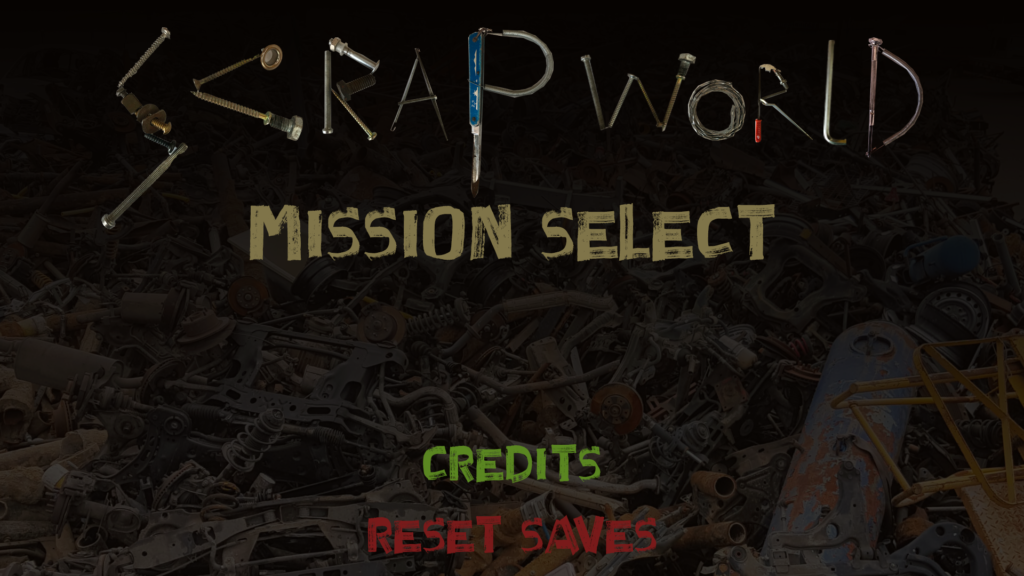
The central concept came directly from the game’s scrap-based theme. Instead of building the title from a conventional typeface, I gathered tools, screws, wires, metal pieces, and other scrap objects from around my home and used them to construct the letters of “SCRAPWORLD.” Each character was assembled from different objects, giving the title an intentionally improvised and mechanical appearance that fit the game’s setting.
I then built the rest of the menu around that concept, using a dark scrapyard atmosphere, distressed typography, and simple color-coded navigation to keep the interface readable without losing the rough visual style. Because of the game-jam deadline, the project was also an exercise in making fast design decisions and working creatively with whatever materials were immediately available.
What I like most about this project is that the time limitation became part of the design process itself. Rather than spending hours creating polished 3D assets or complex typography, I used real physical objects as design elements and turned that limitation into the main visual identity of the menu.
Pixel Art UI Design for “Blinded by the Light”
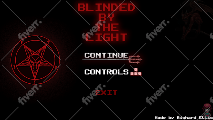
Blinded by the Light was a game project by Richard Ellis, for which I designed the main menu interface and its overall visual style. Unlike some of my other game UI work, this project followed a pixel art direction, so the challenge was to create something that felt deliberately retro while still being clear and functional as a game menu.
I designed essentially the entire screen shown here, including the title treatment, menu typography, button graphics, symbols, decorative elements, color palette, and overall composition. The only element I did not create was the character artwork in the bottom-right corner, which was supplied as part of the game.
The design is built around a restricted black, red, white, and grey palette, with pixelated typography and small interface details that reinforce the visual language of the game. I also used the large occult-style symbol and diagonal background elements to give the otherwise minimal screen more structure without overwhelming the navigation.
Because the interface needed to work within a pixel art aesthetic, I paid particular attention to spacing, contrast, scale, and readability. The result was a menu that could fit naturally alongside the game’s existing artwork while still giving the project a recognizable visual identity of its own.